


Introduction:
It is often said that “the trend is your friend”. One of the common ways to measure the trend of a chart is using the Relative Strength Index (RSI). Developed by J. Welles Wilder in 1978, this oscillator measures the magnitude of the changes in price based on an average to evaluate decreasing or increasing price movement percentage.
Average percent increases or decreases in magnitude help to make a comparative analysis of prior trends. In general, the time period used is 14 data points, however this can increase or decrease depending on the sensitivity required. In short-term time frames (such as 4 hour charts) it might be more useful to use more data, while in longer-term (monthly) charts, as there is less historical data, it might be more useful to decrease the amount of data.
An asset is considered overbought or oversold depending on the trend of the oscillator and how high or low it is. In general, a value of 70 and above is overbought, and under 30 is oversold. Certain assets will have different trendline averages so it’s important to examine what you are looking at before coming to a conclusion. Identifying support and resistance zones is a common way to find trends. Thinking of things too rigidly is not helpful, so be sure to use nuanced judgement and be flexible. That said, once a decision has been made it is important to stick to it.
Calculating the RSI:
For each period the upward or downward price change is calculated. Two smooth moving averages are calculated based on the values of either the upwards or downwards movement. When dividing those two smooth moving averages together, the result is equal to relative strength. This ratio, when plotted on a graph, shows the output as the RSI after the values are then normalized to illustrate a curve to make it easier to read.
Using the RSI and Chart illustrations:
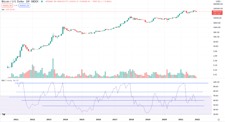
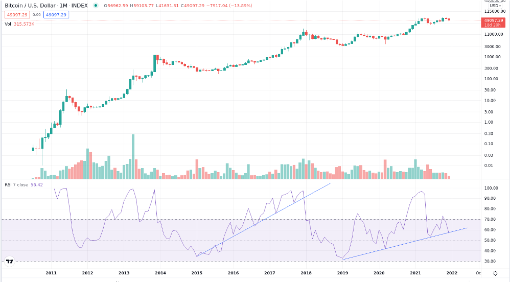
In the NewsCrypto.io Charts section or on TradingView, click on Indicators on the top right of the page. Type in RSI in the search bar and select the option. There should be two charts, the chart of the price, and the RSI graph underneath. For this segment I will be using bitcoin as an example of how to use the RSI by showing multiple charts.
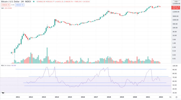
Looking at bitcoin’s monthly chart, as we can see, the RSI shows 48.5 as the lower end of the band, whereas the upper support/resistance line is around 72 based on 14 data points This chart is not very dynamic and doesn’t show much variation.
Conclusion:
As we have seen, The RSI is a momentum indicator that examines average percent differences in movement based on prior history. It is used to identify when average price momentum is inclining or declining. When price diverges from moment, this can indicate that a trend might be ready for a reversal. This indicator can be used in combination with other indicators such as the MACD, Bollinger bands, as well as strategies that examine other variables to identify a historical trend which can function in tandem together to verify its possible accuracy. There are very few rules that are absolutely set in stone in technical analysis, but the notion that confluence is extremely important would definitely be one of them.